How to Use Capital Region Indicators for the CFA
The Regional Economic Development Councils recently announced that the eleventh round of the Consolidated Funding Application (CFA) is now accepting applications through July 30th. The CFA allows municipalities and other applicants seeking funding for projects to streamline their applications and be eligible for NYS funding from a plethora of programs all at once. To make applications more compelling, having data to support your application’s narrative is crucial.
The Capital Region Indicators dashboard uses Decennial and ACS census data to show the current conditions of municipalities around the region as well as allows you to compare the change over time for various data sets. The dashboard provides data on six different topics: Economy, Social Welfare, Health, Education, Housing, Transportation, as well as providing an overview and links to other resources. This data, provided in charts and maps, can be easily linked or shared in your applications to help illustrate important points.
How to use Capital Region Indicators
For a video overview of how to use the Indicators Website, check out this webinar from CDRPC for a complete dashboard overview.
Going to the site at the www.capitalregionindicators.org web address brings you to the main page, or the About page, where you can learn more about the dashboard project, its partners, and mission by scrolling down to the bottom of the page. By scrolling to the top of the page, you can view the dashboard’s navigational options. The dashboard has data for all the municipalities and school districts in Albany, Rensselaer, Saratoga, and Schenectady counties (Capital Region) as well as Columbia, Greene, Warren, and Washington counties (Greater Capital Region). By hovering over either option, a drop-down menu of the corresponding counties will appear. From this menu, you can either select a county or hover over a county to view another drop-down menu of the municipalities within that county.

Once you have selected the county or municipality you’re interested in, you will be brought to that entity’s dashboard. The dashboard page begins with an overview of the county or municipality, highlighting some of the most relevant data points including total population, average median household income, and more. Scrolling down from the top of this page will bring you to the dashboard, starting with the section headings that allow you to quickly jump to different sections of the dashboard. For example, by clicking the Housing heading, you will jump down the dashboard to the Housing section. The Overview section provides a look at the population, age breakdowns, and other data points that give an overall look at the community. This section also features a map that shows the boundaries of the area you are looking at.

Once you begin to scroll down the dashboard, you will notice a box on the left-hand side of the screen. Clicking this box will allow you to change the geography you are looking at, change the current year data displayed on the dashboard, change the comparison year data that generates the comparison stats, or select another geography to compare to. By selecting the geography bar within the box, you can easily switch to another county or municipality without having to scroll back up to the top of the page. Changing the current year data will change the ACS year the data on the dashboard pulls from, allowing you to see how different data points have changed. Changing the comparison year will change the percent change comparisons in the indicator boxes on the left-hand side of the dashboard. Changing the comparison year will not change any of the charts in the dashboard as they typically show a single year. By adding a geography in the compare geography bar, you can directly compare different data points to see how different communities or counties match up to each other.

For every visualization in the dashboard, you have the option to view the underlying data, save the chart or graph as an image, or get an embed code to add the visualization to a webpage. These three options are on the top right corner of each visualization. By selecting View Data, you will be able to view the full underlying data that was used to create the visualization and you will also be able to download an excel file of the data. You will also have the option to save an image of the visualization as a PNG file. The last option, Share Embed, provides two links that you can use to share a visualization, an HTML or JSX link. These links can be embedded into a webpage’s code to seamlessly add the visualization to the page.

Scrolling all the way to the bottom of the dashboard, you can look at just a zip code area or a unified school district boundary within a county or municipality. Using these geographies allows you to break down communities at a different level and can help with applications for projects related to a school district or focused on smaller areas.
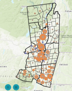
The final tool the indicators website provides is the mapping tool. Accessible on the navigational bar on the top of the page, the map option allows you to easily make maps with custom data points to help further visualize your applications. Maps can be customized with the control box on the left-hand side of the screen. The area bar allows you to select which county or municipality you would like to look at and the geography level allows you to customize if you would like to look at data at the municipal, census tract, or census block group level. Census tract and block group data are useful for looking at specific neighborhoods or sections of a county or municipality. The year bar allows you to choose which year of ACS data the map will display, and the Census Labels bar allows you to customize what data set is displayed on the map. The map feature can display an array of data sets including economic, housing, transportation, education, social welfare, and health data. Clicking on the Legend Selector will allow you to change the colors of the data displayed on the map and the number of steps for the colors. Changing the number of steps can help make the map more efficient for data sets with a wider or smaller range of data. Once you have customized your map to the specific data and geography level you need, you can save the image by selecting Save Image on the top right legend box.
Any other questions on how to utilize the Capital Region Indicators website? Contact cdrpc@cdrpc.org