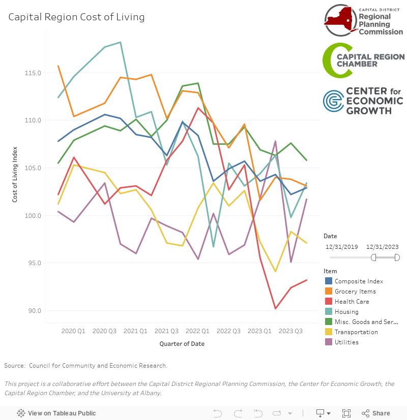
Cost of Living Becoming More Affordable but Still Above National Average
Changes to the Capital District’s Cost of Living
Since Quarter 1 (Q1) 2018 the Composite Index, a compilation of the cost goods and services of multiple indexes, declined from 108.6 to 107, a 1.47% decline. After increases last year, the Composite Index moved back closer to the national average. In the case of the Composite Index, the cost of living in the Capital region is approximately 7 points higher than the national average for all urban areas in the country.
Some other key insights this quarter include:
• Housing saw the largest decrease since Q1 2018, starting at 118.7 and dropping to 110.5 by Q2 2019, a decrease of 6.9%.
• Health Care costs have been steadily decreasing over the past year, starting at 105.8 in Q2 2018 and declining to 103.2, a decrease of 2.5%.
• Grocery Items saw the highest increase over this period. Starting off at 106.5 in Q1 2018, costs have increase to 113.9 in Q2 2019, representing a 6.9% increase from Q1 2018.
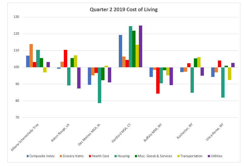
• Transportation was the only Index below average in Q2 2019 at 97.
What is the Cost of Living Index?
Compiled by the Council for Community and Economic Research, the Cost of Living (COLI) Index collects data from cities across the country and tracks changes in the cost of vital goods and services that contribute to an overall cost of living. Data on the cost of Grocery Items, Health Care, Housing, Miscellaneous Goods and Services, Transportation, and Utilities are collected and compiled into separate indexes, and a Composite Index is created which combines these separate indexes and shows the general trend for the cost of living in different cities and metropolitan areas. The data for the Capital Region is collected quarterly by graduate students enrolled in the Department of Geography and Planning at the University at Albany and is funded through a partnership among CDRPC, the Capital Region Chamber of Commerce, and the Center for Economic Growth. The methodology, data requirements and parameters of the data collected are consistent nationwide to assure comparability among the participating regions.
When data is collected, it is converted to a scale which puts the average cost for each index at 100. Data for the Capital District is collected for the Albany-Schenectady-Troy Metropolitan Statistical Area. This allows us to compare the cost of living in the Albany-Schenectady-Troy area to any other city or metropolitan area in the country, regardless of size or population. For example, the cost of living in Manhattan, which topped the Q2 2019 national list, is 242.5. This is 135.5 higher percentage points more than the cost of living in New York’s Capital Region. The lowest cost of living for this quarter was in Harlingen, Texas with an index of 73.8. If a city or metropolitan’s index is over 100, then the cost of that index is higher than the national average. You can learn more about the COLI Index here. Below you can see comparisons between the Capital Region and other peer areas for Q2 2019.
Last year, CDRPC provided an update on the 2018 Quarter 1 (Q1) Cost of Living Index provided on our website, in which we determined that the cost of living in the region had remained generally stable. That article can be viewed here. With current data through Quarter 2 of 2019, we can take a look at the last year of data to compare how the cost of living for various indexes has changed over the past year.
The peer MSAs for this comparison were chosen based on selections made in the 2015 Capital Region Indicators Report. Sections were made based on two criteria;
-
- The MSA must contain a state capital.
- The MSA must have a population within 40% of the Albany-Schenectady-Troy MSA population.
Based on this criteria, 11 MSA were chosen as peer MSA, and the Buffalo, Rochester, and Utica MSAs were included because they are major cities in Upstate New York.
Cost of Living 2010 – 2019
Since 2010, the indexes have fluctuated with both cost increases and decreases across the board. The Composite Index saw alternating years of increases and decreases over the past nine years. Starting at 107.7, the Composite Index saw an increase to 112 in 2011. Between 2011 and 2015, the Composite Index would fluctuate but ultimately stay consistent until it hit a high of 114 in 2015. 2015 would be a high cost year across the board for almost all the indexes. After hitting this high, the Composite Index would begin to trend downwards again through 2017, where it hit a low of 105.7. The Composite Index has begun to increase overall again and currently sits at 107.
For all Indexes except Health Care, 2015 saw a 9 year high in costs. Health Care saw its high in 2014. For all Indexes except Grocery Items, costs saw significant drops after their 2015 highs. The Grocery Items, Health Care, and Utilities Indexes all saw downward trends after 2010 until spikes in cost occurring in 2015.
Housing has consistently been the highest cost index over the past 9 years. Besides dips in Q1 2013, Q1 2016, and both quarters of 2019, Housing costs have typically been far above all of the other indexes. Starting at 109.7 in 2010, costs trended upwards through Q4 2012 until it dropped to a low of 108.2 in Q1 2013. Costs would trend back upwards until reaching a high of 126.7 in Q2 2015. Costs would fluctuate over the next four years until it reached 110.5 in the current quarter.
Utilities, Health Care, and Grocery Items all dipped below the urban area average of 100 for multiple years in the earlier years of the decade. Both Utilities and Health Care dipped below 100 in 2012. Utilities stayed below average until the beginning of 2017, where costs would jump up above the average until dipping back below by the end of 2017. Health Care costs remained below average between 2012 and the end of 2017. Grocery Items fell below average for a little over a year between Q3 2013 and Q1 2015. Currently, Transportation is the only index that has dipped below average at 97 in Q2 2019.