How Birth and Marriage Rates Could Dictate Department of Transportation (DOT) Spending
These maps were created for the Transportation Council in response to a memo from the U.S. Department of Transportation, which states that the organization “shall prioritize projects and goals that…give preference to communities with marriage and birth rates higher than the national average.” To better understand how our four counties compare to others in New York State, the CDRPC developed a series of maps illustrating birth and marriage rates at both the county and local levels. This analysis reveals regional trends that will help guide and inform transportation planning in the region.
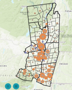
The first set of maps presents data for all counties in New York State, categorizing them into three groups: counties with both high birth and marriage rates, counties with only high birth rates, and counties with only high marriage rates. The second set of maps focuses on the Capital Region only, using census tract-level data to mirror the same comparisons made at the county level.
For this analysis, an area is considered “high” if its birth or marriage rate exceeds the national average. Since there is no established precedent for calculating national birth and marriage rate averages or determining which datasets should guide funding allocation, CDRPC utilized the best available data from the U.S. Census. The national averages used, 46.9% for marriage rates and 5.2% for birth rates, were derived by averaging state-level data. The data for this analysis comes from the 2023-19 ACS 5-Year Estimates, specifically Tables B11001 and B13002. Use the arrows on the maps below to view demographic trends in the Capital Region.